TreatmentSolutions .com Overhaul
TLDR:
Roles and Responsibilities:
- UX Researcher
- UX Designer
- Lead Designer
Project Context:
- 2 months, September 28 - November 20, 2022
- Jr. Product Designer at American Addiction Centers
Tools Used:
- Google Analytics
- Figma
A New Challenge
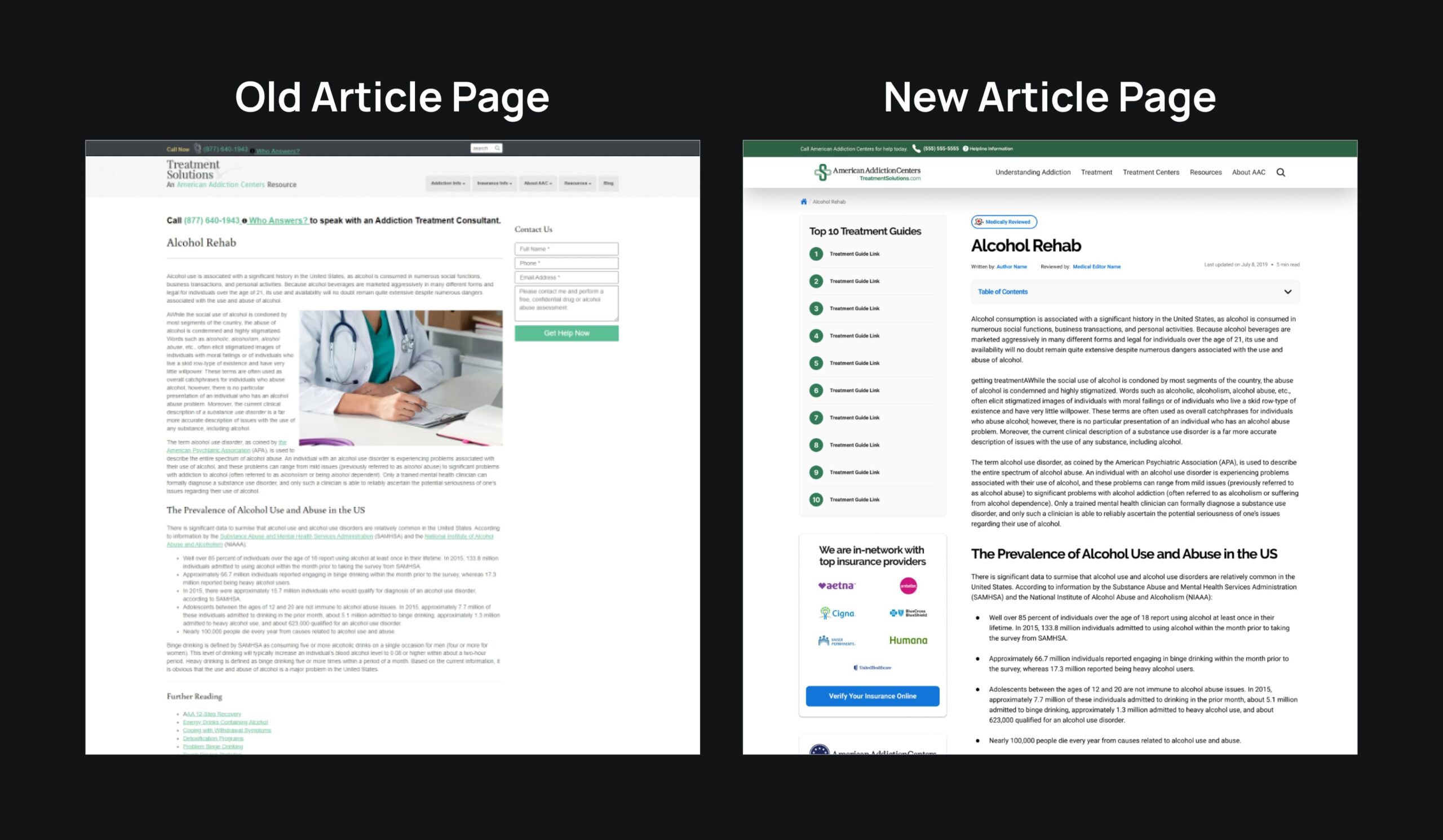
In Q3 2020, shortly after my Treatment Overview Redesign project, I was reached out to by the product owner for the Outliers product team. He wanted to take an old website that we own and breathe new life into it within two months. This was new to me because before this I had primarily focused on one product only, the Facilities product team -- and never have I redesigned a whole site essentially from scratch.
I was told that I'd be the only designer on the project, responsible for all of the following:
- Branding (typography, color, brand assets)
- 20+ Pages and template designs
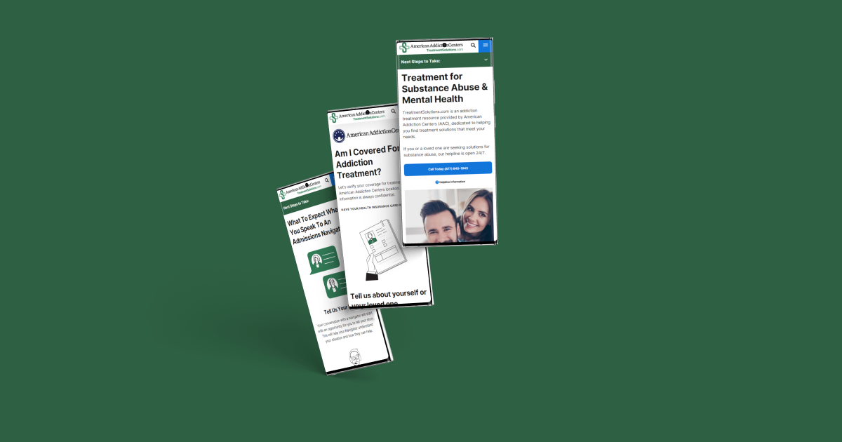
- Other global elements (navigation, shortcodes)
It was a large undertaking, but I was excited for a new challenge, and agreed to take it.
Research and Analysis
To kickoff the project, I was given a brief introduction to what and why we were doing it. In an attempt to further my understanding and also help support Manish, I deep dived into my own analysis the week before the official project start date.
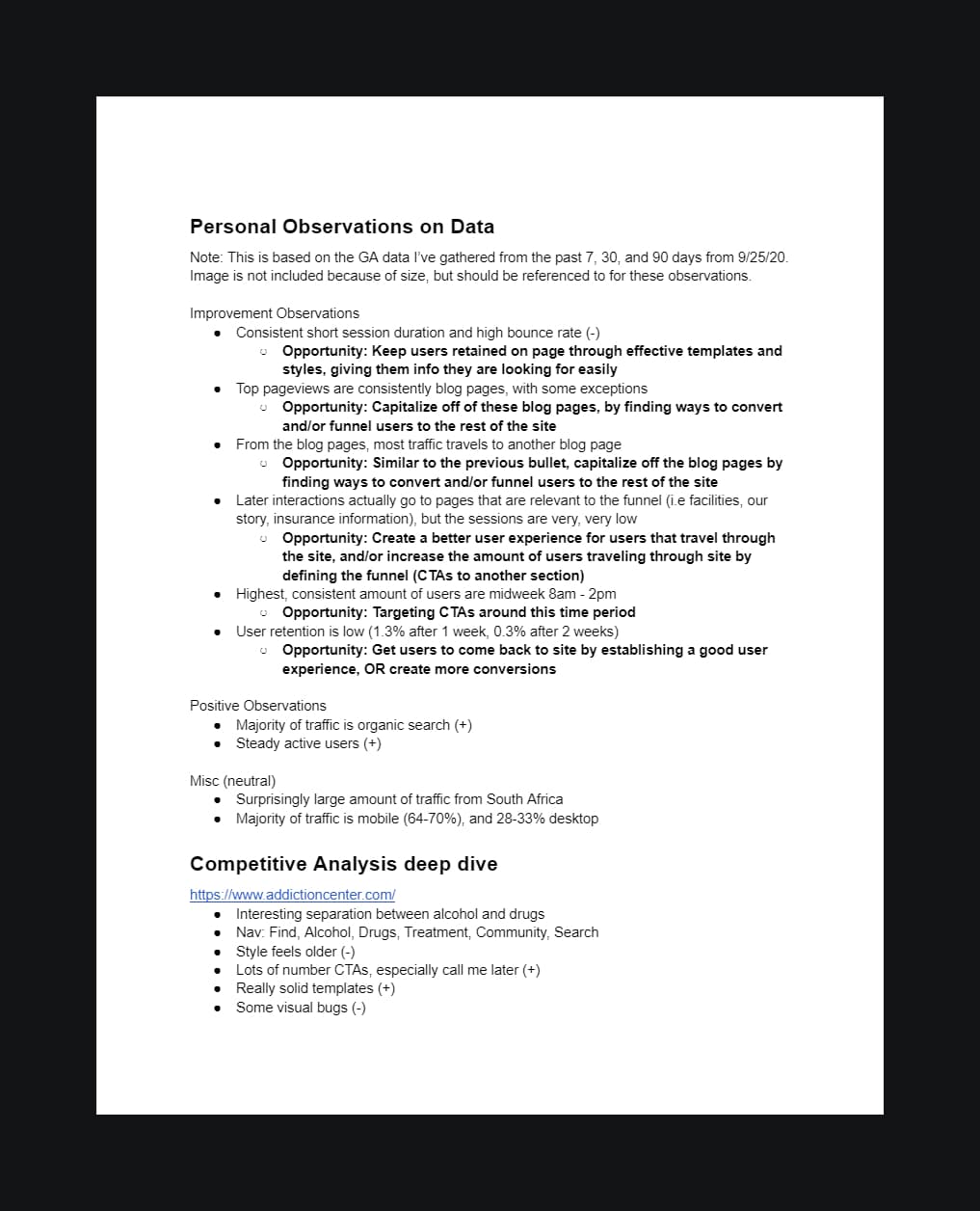
At the time, Google Analytics was my go-to tool for data reports and analysis, so I started digging around the site's history for any insights that could be helpful. I gathered some data and made suggestions on what I saw were potential opportunities.
Following this, I did a thorough competitive analysis on five other sites that were referenced in the briefing with Manish. I would look through all of these sites, and using a rubric for UX standard, grade them. Through this I saw what these other sites were doing well to take as inspiration, as well as taking note of things they lacked to take as things to avoid. I did the same with our site to see the baseline of where we were at.
Branding
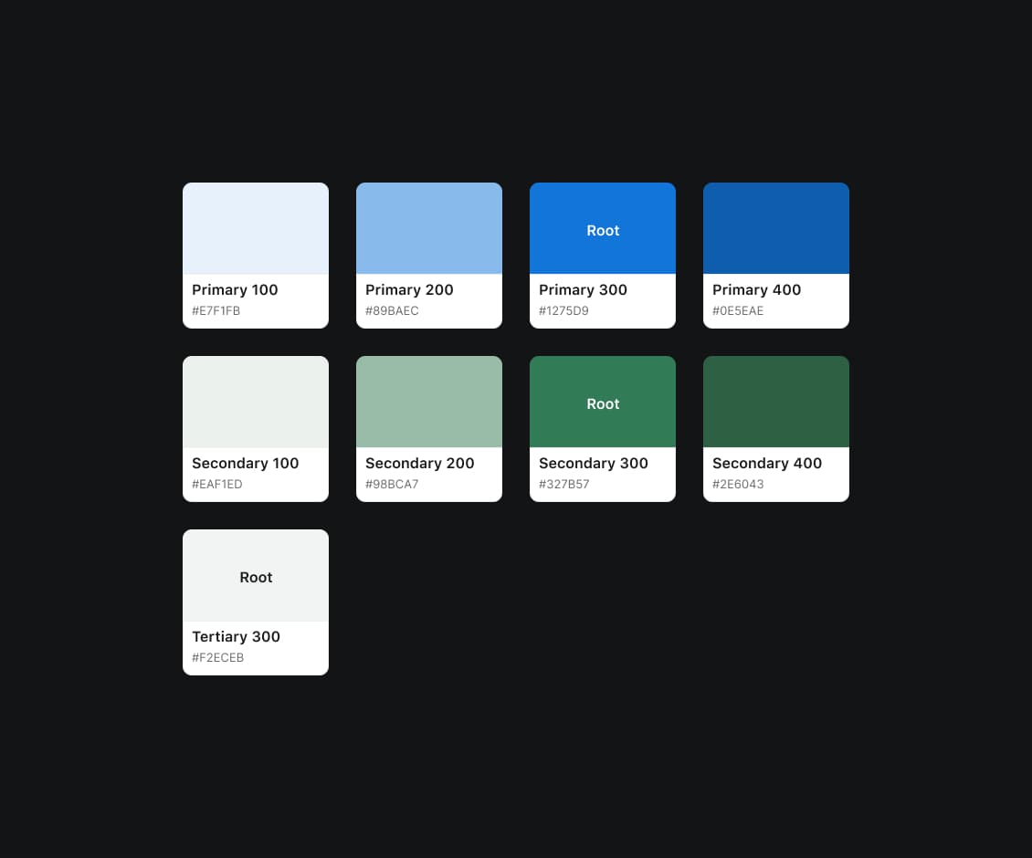
Taking inspiration from the rest of our portfolio, as well as some online research, I settled on a color scheme as well as typography system that fit the site's theme.
I wanted TreatmentSolutions to convey a sense of medically-professional, as well as hopeful and friendly. The green as the primary color helped align what I had in mind.
I wanted to have a bold header font, paired with a very clean and legible body font.
As for brand assets, I was stuck for a while and worked with my design manager to come up with a new logo. I have him to thank for creating the final design of the logo.
The Iteration Process
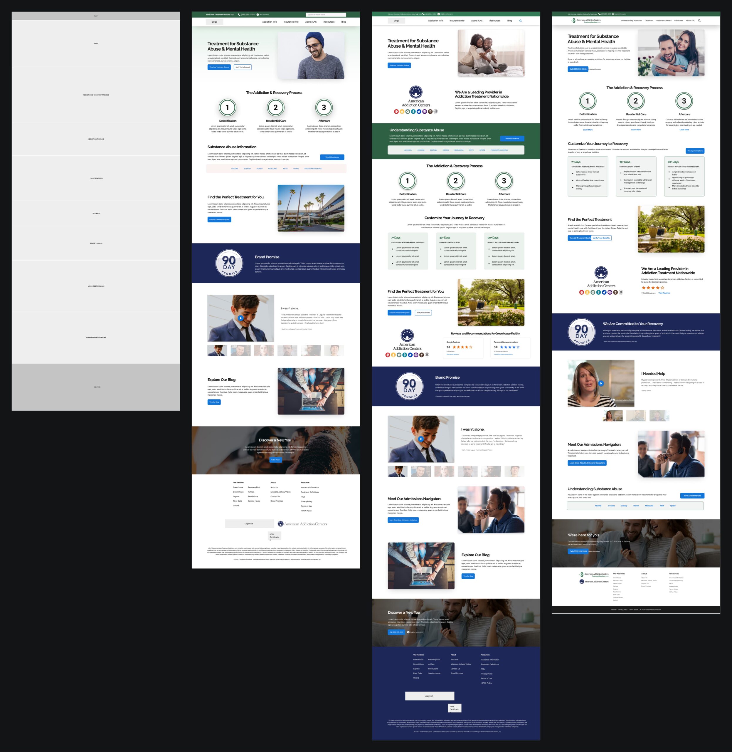
I started many of the designs in low/medium fidelity, moving to review with Manish, going into high fidelity, meeting with Manish, making iterations, and repeating the process.
1. Start with a low/medium fidelity mockup on Figma
2. Meet with Manish or talk on Slack to discuss
3. If necessary, make changes and review
4. Once the low/medium fidelity mockups were good, move onto high fidelity mockups
5. Meet with Manish or talk on Slack to discuss
6. If necessary, make changes and review
I would be able to knock out 1-3 pages a week with this process. Some pages however took a lot longer due to pushback or feedback from SEO or content.
Challenges
One of the challenges I had were the open-endedness of each task that I had. For virtually all of my tasks, I would have just the page or template name as the description. Knowing that it was somewhat open-ended gave me some amount of freedom and flexibility, but at the same time it would sometimes lead to scrapping ideas and starting new when it was time to review, lengthening the process. In order to solve for this, I would stay out of high fidelity until it was approved (in the beginning I did a couple of high fidelity versions because I was confident in those designs). This also led to the process that I outlined in the section above.
Another challenge that I had was simply communication. I had the honor of working with Manish, he's a brilliant guy. However, over time I had a feeling that he was the type of product owner that works better on solo projects. To try and improve our communication together, I pushed myself to be very transparent with him at all times and adjust to how he worked. It hit me that I was so familiar with working with my usual team that I didn't know how it was to work with someone with a much different, solo-focused, perspective.
At one point I think there was a major time zone difference because he was out of the country (around 13 hours), so making sure that we were on the same page through effective communication was crucial to not waste any of our limited time.
Takeaways
Since the launch, we've had 649,881 total sessions on the site. Before then, we were having >192,000 sessions a year. We also experienced significant percent increases in click-through-rate (CTR) and some key performance indicators (KPIs). Thanks to this new overhaul, I believe that the site was more friendly and intuitive to users and allowed more people to navigate through the site with a much better experience than before. My redesigns were not the only factor that contributed to this, however, as we had SEO, developer, content, and QA support to really push this site forward.
I remember going into this project worried about how much of an undertaking it would be, and it was, but ultimately I felt myself grow as a designer being continuously challenged week after week. The struggle to get everything complete within the project's time frame really pushed me to be efficient with my time. The hours I had spent overtime are a testament to me now being more efficient with clear task requirements and stronger communication skills.

