
ClientReach App Overhaul

Results at a Glance
Making ClientReach Useful and Trustworthy
ClientReach is the B2B client portal used by American Addiction Centers to manage addiction treatment listings on multiple directory sites, including Rehabs.com, a major directory site in the addiction treatment industry. While it was functional, it was showing its age, not being updated in over a decade: the UI was dated, navigation was confusing, and clients struggled to find the key data they cared about.
The portal didn’t feel like a tool that earned its keep. Clients often contacted support to clarify basic metrics or billing questions, and many found the experience frustrating. The challenge was to transform ClientReach from a clunky backend into a polished, modern platform that gave clients confidence in their investment and helped them better manage their listings.

Listening Closely to Clients and Stakeholders
Before diving into design, I dug into user feedback and analytics to understand pain points and opportunities. Working with our PM and customer support liaison, we gathered insights from:
- Support tickets, which revealed common confusion about billing and listing metrics.
- Direct interviews and surveys with clients which uncovered frustration with finding data and poor usability.
- Internal teams: sales, account management, and product. These were folks who reported clients repeatedly asking basic questions about submissions, views, and payments.
Key takeaways included:
- Clients didn’t have an easy way to see how their listings were performing. The metrics were buried or unclear.
- Navigation was unintuitive and inconsistent, making it difficult to move between sections like analytics, billing, and support.
- Some important features, like managing payment methods or accessing support documentation, were hidden or hard to find.
- Visually, the portal felt disconnected from the Rehabs.com brand, lacking polish and hierarchy.
Prioritizing Impact and Feasibility
Given a two-month sprint and a lean team (myself as sole designer, plus PM, two engineers, and QA), we scoped the redesign to focus on:
- Usability: Create a streamlined navigation experience with clear labels and a logical structure. Make confusing pieces intuitive.
- Data Visibility: Surface key listing metrics in easy-to-understand charts and tables.
- Visual Refresh: Implement a clean, flat UI aligned with Rehabs.com branding for consistency and trust.
The goal was a strategic balance, not a full rebuild with new features, but a meaningful redesign that improved existing workflows and set a foundation for future growth.
The Redesign Process
Design System: Clean, Flat, and On-Brand
The entire UI was redesigned from the ground up with a clean, flat aesthetic:
- Larger, readable fonts with generous spacing
- A calming color palette using brand colors for emphasis, creating a trustworthy atmosphere
- Consistent iconography and button styles for familiarity
This visual overhaul would transform ClientReach from a clunky admin tool into a sleek, approachable SaaS-style dashboard.

Navigation: Clear Paths to What Matters
I introduced an improved sidebar navigation experience to replace the old one. This sidebar grouped pages into logical sections:
- Overview Dashboard: The landing page with key metrics and quick actions
- Listings: Manage individual treatment center listings with status tags and editing tools
- Reviews: Easily access and respond to client reviews
- Billing: Transparent invoices, subscriptions, and payment management
- Support: Centralized knowledge base and contact options
- Settings: User profile and account configurations
Adding quick access links and multi-listing support helped clients with multiple locations toggle easily between them. The sidebar’s enhanced layout improved readability with cleaner fonts, spacing, and subtle color accents for hierarchy.

Login: First Impressions Count
The original login screen was dated and visually disconnected from the product itself. I redesigned it to better reflect the new UI language and reinforce trust at the entry point. Clean layout, brand-consistent colors, and clearer feedback states created a more polished, professional feel from the start. It set the tone for a modern experience and made logging in feel more seamless and intentional.

Overview: Making Metrics Meaningful
The Overview screen got a major upgrade with a new line chart visualizing listing performance over time. Users could filter views by listing, metric (views, clicks, calls), and date range, making the data relevant and customizable.
Below the chart, a metrics table displays key performance indicators:
- Views MTD (Month to Date)
- Clicks MTD
- Calls MTD
- Card Impressions MTD
- Average Cost Per Action (CPA)
A new export report button simplifies data downloads for clients who want offline analysis or reporting.

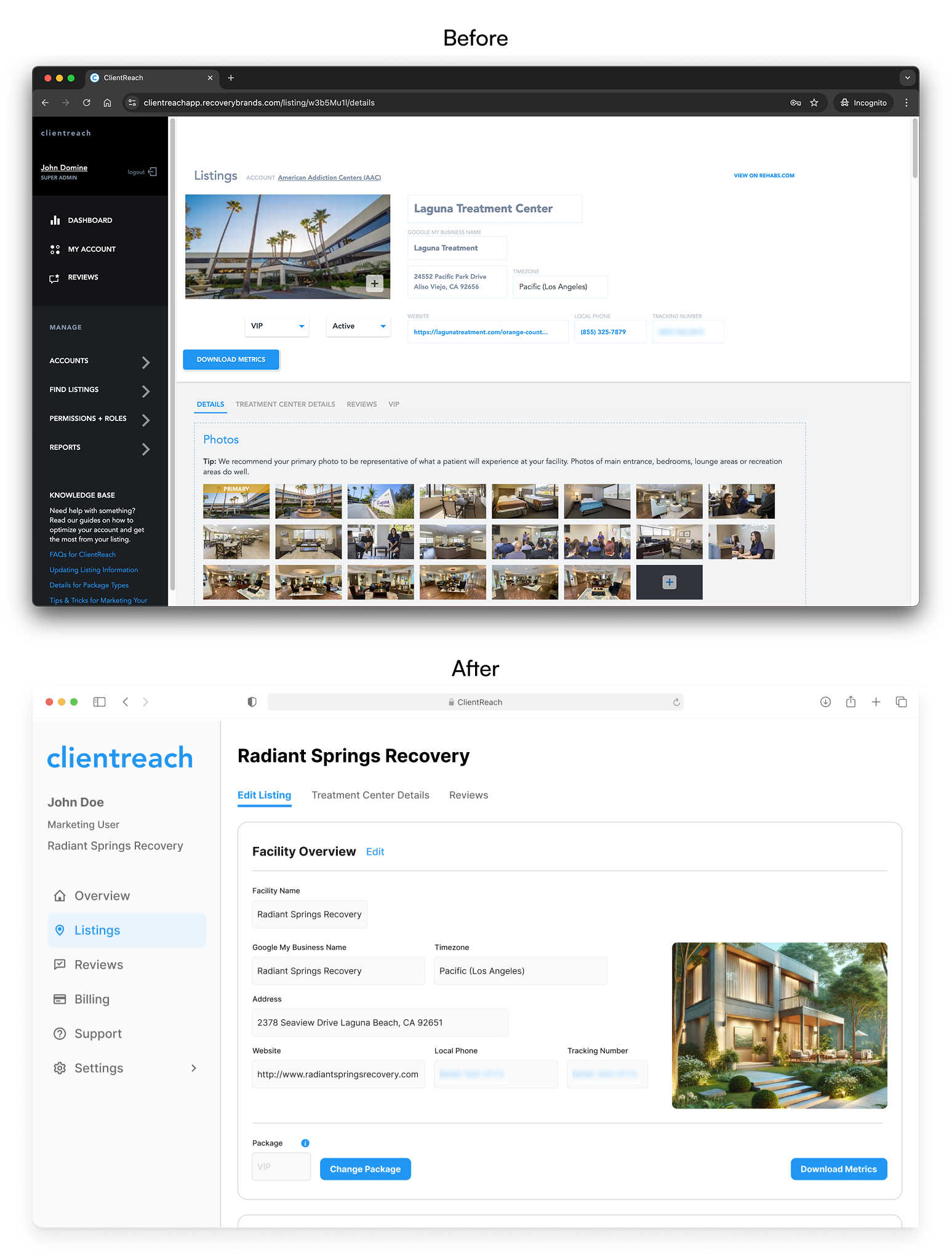
Listings: Streamlined and Intuitive
The Listings page was revamped to better match the public-facing site, so clients had a clear mental model. New status tags show whether listings are active or inactive and indicate package types (Standard, Promoted, VIP).
The editing layout was optimized for clarity and ease, with inputs aligned closely to how content appears on the live site. We introduced version control by package type, meaning clients with different subscription levels see features relevant to their plan, preventing confusion.
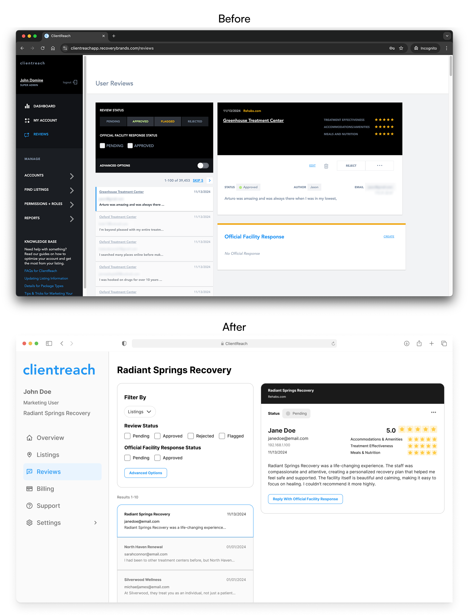
Reviews: Focus on Readability and Access
The Reviews section got a thoughtful visual refresh to improve clarity and usability. Key information like star ratings, dates, and client responses now stand out with improved hierarchy, while the current review stays fixed on screen, making it easier to reference while exploring the rest of the page.
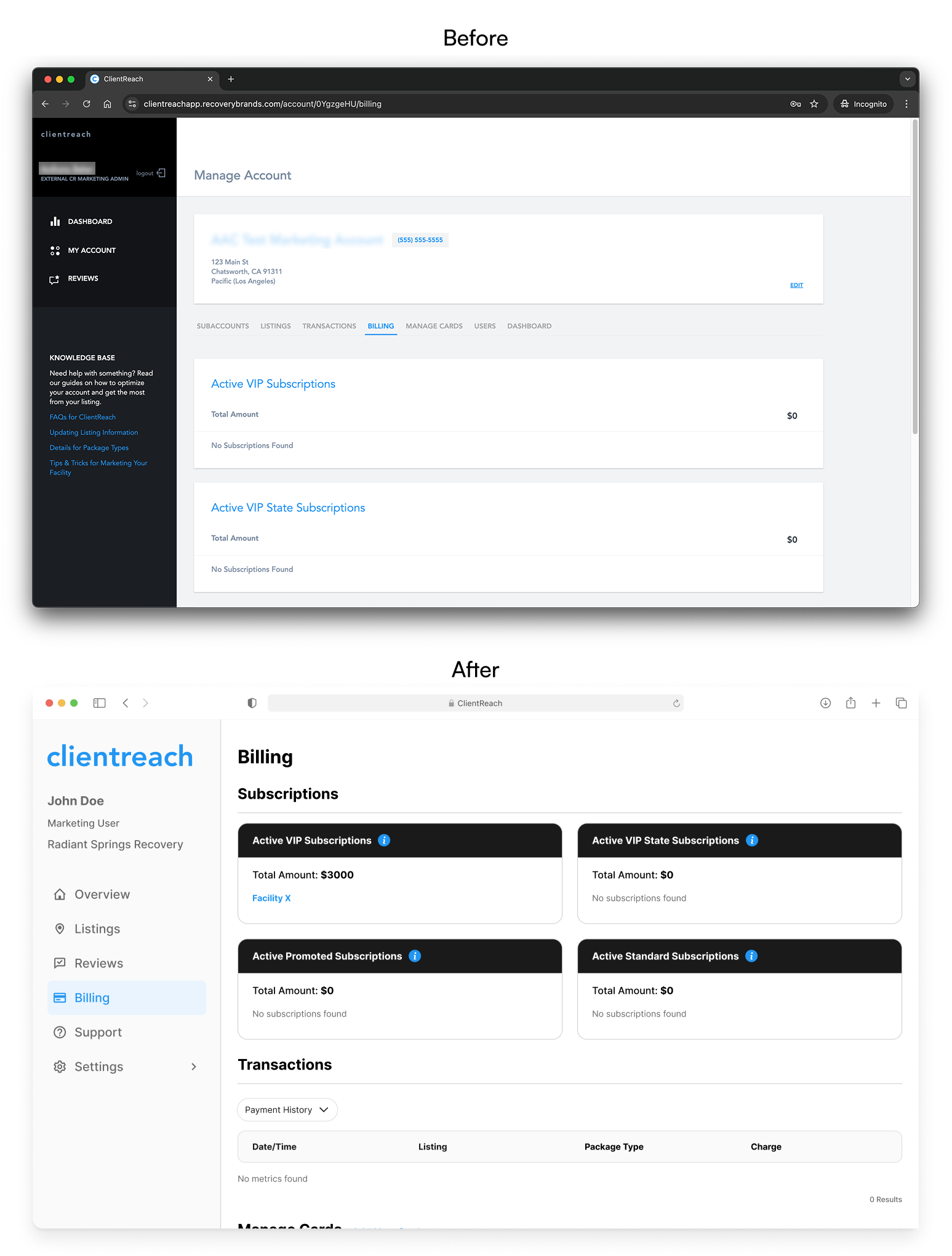
Billing: Transparency and Control
Billing became more user-friendly with a refreshed layout that separates invoices, subscriptions, and payment methods clearly. We combined the Transactions and Manage Cards tabs, simplifying navigation and allowing clients to easily update their payment information.
Clients now have a better sense of their billing history and plan details – reducing confusion and support requests.
Support: Knowledge at Their Fingertips
Support moved from a hidden sidebar tab to a fully fleshed-out page with a knowledge base, documentation, and direct contact options. This shift empowered clients to find answers quickly without needing to reach out to support teams for basic questions.
Happier Clients, Better Metrics
The redesigned ClientReach launched on schedule and was very warmly received. Key outcomes include:
-
17% increased client logins and 32% longer session times
-
6% increase in claimed listings
-
13% clients upgrading paid packages (estimated ~27% monthly revenue increase)
-
Reduced support tickets related to billing and navigation

Beyond Just a Redesign
This project reinforced how much a thoughtful UX and cohesive visual system can improve a legacy tool’s value. It wasn’t just about making things prettier, it was about building trust through transparency, usability, and responsiveness.
Being the sole designer pushed me to manage priorities carefully and collaborate deeply. I balanced ambition with scope to deliver meaningful improvements quickly.
The redesign now sets the foundation for future growth, including plans for personalized insights, in-app messaging, and more granular account management. The following are some of my final thoughts and takeaways from the project.
- Emphasizing clarity and control improves engagement. By cleaning up the UI, we made the product feel more transparent, actionable, and worth paying for.
- Small, strategic UX decisions can lead to big business impact.
- Aesthetics are just a piece of the solution; the redesign improved structure, scalability, and client workflows.
- Listening closely to client and team feedback helped shape a product that felt more intuitive and aligned with user needs.