Treatment Overview Redesign
TLDR:
Roles and Responsibilities:
- UX Designer
- Lead Designer
Project Context:
- 2 months (July 21 - September 28, 2020)
- Jr. Product Designer at American Addiction Centers
Tools Used:
- Sketch
- Abstract
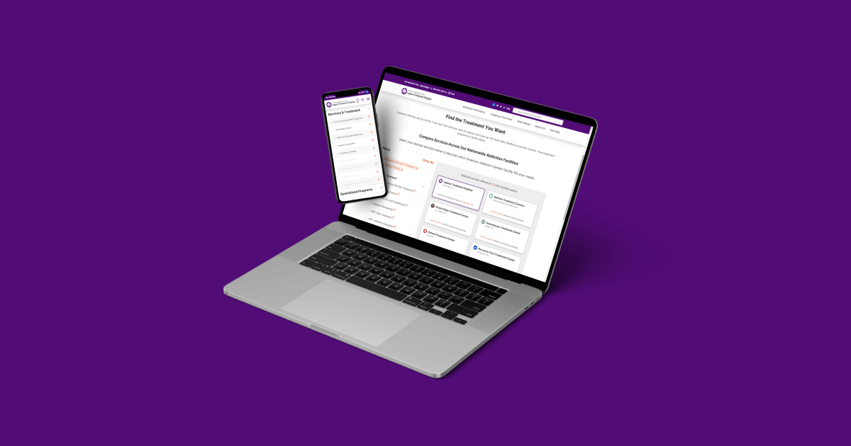
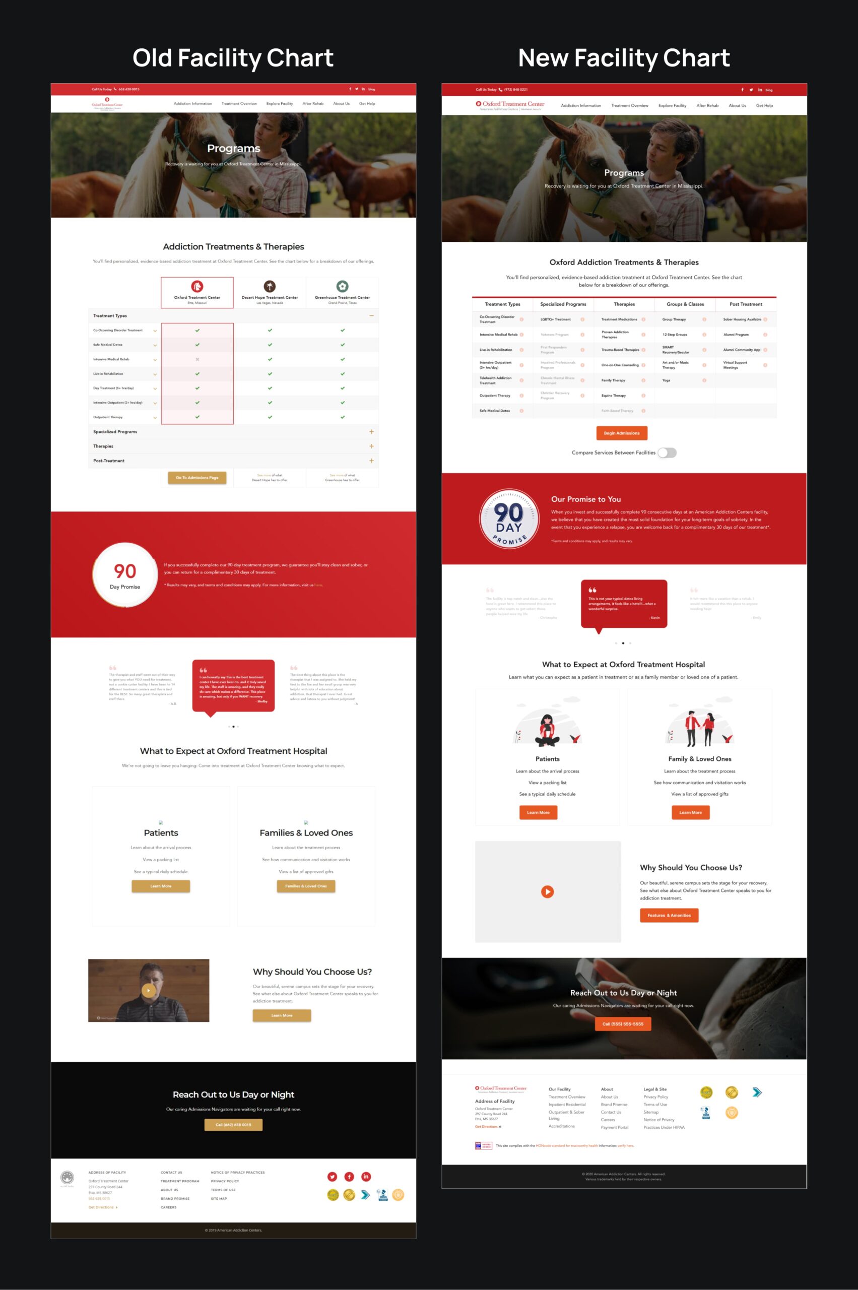
The Treatment Overview Chart
I had the honor and pleasure of working as the primary designer for the Facilities product team during my time as a Junior Product Designer. The product had 7 sites to manage, all tied to different brick-and-mortar addiction treatment facilities all across the United States.
Around Q3 2020, my product manager wanted to find a project for all of the design team to work together on since we're all working on separate products and therefore projects 99.9% of the time. Coincidentally, the Facilities Product Owner had just come up with this idea to redesign a chart on one of our highest intent, high trafficked pages. It was on the Treatment Overview page, and she thought it was time to redesign the treatment offerings and amenities chart.
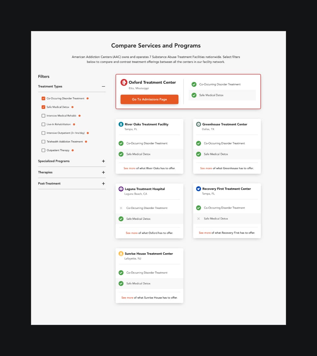
There were a couple of problems to this chart:
1. It was awkward and hard to digest
2. There was extra interaction cost for essential information
3. Some buttons and functionality came off confusing
Following some discussion, I was given the responsibility to lead and oversee this project in collaboration with the design team.

Leading the Design Team
This was new and exciting for me, and I thought to be a good leader in this project I would need to be transparent and communicate well with all stakeholders involved. Our next steps would be creating a mockup of the chart, each of us exploring different concepts and options. Following that, the plan was to review with the product owner and see which of the mockups she thought would work the best, and move forward with it. It was like a multivariate optimization test, with each of us creating one variation.
I set up estimated deadlines for us to hit, as well as detailed instructions on how to reach our goals. I also set up time for us to review our progress and made it clear that I was ready to help where I could.

Team Variations
Rachel's concept was to explore a toggle feature.

Jian's concept was the minimal viable product (MVP).

Bryce's concept was to explore an Amazon-like filter system.
My concept was highlighting the facility the user was on.

Combining Our Strengths
After meeting with Sarah, she found that different pieces of each of these variations could prove to be useful in the redesign. It was an awesome feeling to see us pivot from the original plan of picking one variation to combining variations - to me it showed how each of us had something strong to share, and how important collaboration was on a project like this.
The next step then was for me to take those notes and combine the variations to make a new variation of the designs. Not only that, I would showcase the functionality of all the different steps that this design would have, specifically on the filter system.


The Handoff
After reviewing the new redesigns, we were all set for developer handoff. I used the frames that I had worked on for the presentation and made it as readable to our developer as possible.

Challenges
Challenges that I experienced were working with the design team because they were on their own timelines with their own products. There was a reason that we didn't often collaborate and work on projects together, and that was because most of our time was spent working on our own products. I would often have to reschedule reviews because designers couldn't spend time on this project because of their sprint-work.
Unfortunately there wasn't much of a workaround to this, but being patient and offering to help where I could helped the process go a lot smoother.

Takeaways
Since then we've had around 6000+ leads per site with a higher conversion rate from lead to our other key performance indicators. I believe the strength in focusing on the treatment center's treatment options was key, and having the comparison be optional for those who were looking for offerings that weren't available at that center. It's a night and day difference between the original and new designs, with functionality and readability being vastly improved. Also having a strong filtering system was a big win from this project.
All in all, it was a fun project to work on because I was able to work closely with my fellow designers. It was nice to see that a piece of all our variations made it in the final production.


